Create or appropriate a poem/text work/words/characters. Using Adobe Illustrator make two visual designs for your words that play with the visual presentation of the type using some of the methods we discussed in class.
Include 200+ words on your webpage explaining your typographic approach – font, size, movement, shape – and how the text integrates with whatever other elements you have included.
Let me preface this explanation by letting you know that this is my first time using illustrator. I thought it would be more like photoshop, but it’s VERY different. I felt very limited compared to working in photoshop. I can see how down the road it could be an unbelievable tool to create once I have a lot more experience.
That being said, I am enjoying learning a new program, however, my design is a lot simpler than originally planned. The truth is even though I had a grand plan to use all the fun text tools, I felt like a simpler design ended up being more powerful.
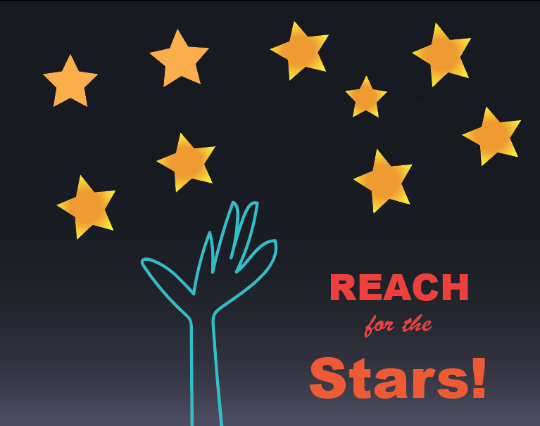
Originally I imagined the hands as text outlines, but the writing was really hard to read. It looked cool, but what’s the point of adding text if the viewer can’t read it. I decided to go with a simpler text to compliment the design.
These designs are geared toward children, and I really wanted them to get the point, more than showing you that I can use text to follow a path for the sake of it. I even drew the hand in a childlike manner to help children relate.
The background layer is a gradiant to look like the sky, and the stars were kept simple with a circular gradient. Even creating simple gradients was a challenge. I kept wanting to switch to photoshop.
Like I already mentioned my original plan was to have the text follow the outline of the hands, but it was illegible. I differed to plan B to fill the negative space with text instead of creating more hands. Like the typography videos suggest, the colors of th text are brighter than the rest of the image and the most important words are bold.
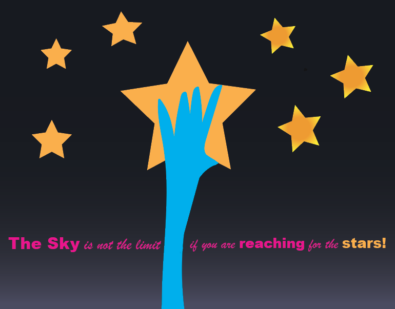
You will also notice I played with size and font style to emphasize the most important words, like REACH and STARS! In the second image I had a really difficult time deciding on the colors. All the colors I tried looked a little forced and contrived. I decided to go with a pink because I have noticed that in advertisements like T-Mobile and Apple it really pops. Then I used the color of the stars for the word star to tie it all together.
I consciously decided to keep the design simple instead of trying to add extra text to show you that I can use illustrator. The design and text work together. I just hope it’s what you are looking for. The last time I sent you a simple design, you didn’t like it. I only have done graphic design for the UN, maybe subconsciously I go into vanilla mode - creating something that will not rub anyone the wrong way.
I do think the message is strong. It’s just going to take me awhile to learn Ai enough to speak my mind as well as I am able to in photoshop. It’s a challenge, but I am up for it.